Sunday, November 1, 2015

Vintage picture frame decorative jewelry organizer


Since I compulsively purchase decorative paper, this worked out well for me!

I found some lovely vintage frames at the thrift store and decided to get crafty.
Steps: remove the artwork and trace it onto the back of the paper you want to use, then cut it out, re-frame it, and you have a pretty way to hang your jewelry.  Be sure to hang them a good distance from each other (if you make more than one), to accommodate long chains and necklaces.

Friday, October 9, 2015

Halloween "Dumpkins"

Dumpkin? Pumpernut? Whatever you decide to call them, these festive squash were a hit!


Sometimes it's really fun to make something purely for your own amusement, because it's cute, because it's festive, because you want to! I do so many projects that feel serious and important (to me) that it can be really rewarding to just let go and play. I love Halloween, art projects, sprinkles, donuts, and making treats for friends, so these were perfect in every way!

Pumpkins by Studio DIY
Originally, I was inspired by the project posted by Studio DIY, where she created beautiful little pastel gourds with individually painted colorful sprinkles.

I decided that I wanted to create some that looked like they were really frosted, and to save myself a little time by using cute holiday sprinkles instead.

Materials needed:
   -  acrylic paints (brown, white, orange, and yellow)
   -  Golden gel medium, Gloss
      (you can get this at most craft stores, or online)
   -  festive sprinkles
   -  mini-pumpkins
   -  a big, soft paint brush

Project time: approx. 1 hour, for 15 pumpkins


I liked how Kelly, the Studio DIY blogger, had applied a base coat that was a bit less pumpkin-y orange and closer to donut color. I mixed the yellow, orange, and white with a touch of brown to make a color that looked like what a donut-pumpkin-hybrid (or offspring?) would resemble. I lined up all the little pumpkins on paper grocery bags that I'd cut up for a craft surface, and coated them with the paint I'd mixed up, including the stem.

In order to make the paint super shiny like frosting, I mixed in a large amount of the gel medium (about 50/50 paint/medium), and applied it to half of the pumpkins. I did the white "vanilla" batch first. Start with a circle a little less than half an inch away from the stem, and make a bigger circle about a third of the way down the mini pumpkin, so that you can then you can messily "frost" the area in between.

The pumpkins in the back have just the
base coat - ready to be "frosted"
After they were all frosted, I sprinkled on the decorations! Do this right away, before the paint dries. If it's not tacky enough, and the sprinkles are falling off, you can dab on a bit more paint and stick them on individually. Use your fingers to place more after you've sprinkled on the initial ones, to arrange them. For the white pumpkins, I tried to use a bit more of the orange and black sprinkles for good contrast.

Repeat this with the brown "chocolate" frosting set, and you'll have a great mixed batch! In fact...wouldn't it be ADORABLE to do a set of 12 and find a pink pastry box...?

I passed these out for friends and co-workers, and they were such a big hit that people were demanding more even after they were all gone. To make them more festive, I put them in small plastic treat bags with a few candies and halloween treats, and tied it with an orange bow. NOTE: If you do give them out in a plastic treat bag, let the recipient know to take them out right away -- the moisture from the pumpkin made the sprinkles melt after a couple days, for those that were left in the bags. I might consider a little box or muslin bag instead, if I make them again.

Thanks for reading, and I hope you try it out and have fun experimenting! Thank you to Studio DIY for the inspiring craft ideas.

Saturday, September 5, 2015

Digital after-life - the creation and re-creation of the album art for Bosse-de-Nage's III

Part of being a creator-of-things is the ability to let a piece of yourself go. Once you make something, it's sent off into the great wide world, largely outside of your control, to take on new life in the digital realm.

Sometimes I can't help but be amused at the veritable rainbow that's become of the original art for Bosse-de-Nage's album, III. Online, anyway.

I think back to the many discussions on color, visual meaning, and philosophy that the band and I had as we put the finishing touches on the work -- a journey feeling every bit as complex and transformative as the creation of a musical piece.


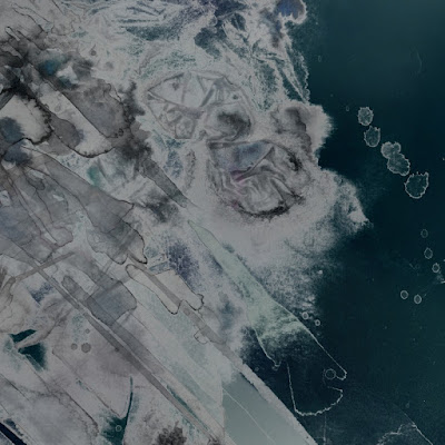
Indeed, the final version is quite different from the original, which I still have stored at home. I started out with pencil and watercolor, but allowed it to take on shapes of it's own, not wanting my hand to have complete control over what I hoped would be fitting such a surreal, dark, and sometimes chaotic and conceptually abstract sound. As it progressed, those were just the types of amorphous shapes that started to occur. The band found lots of hidden shapes in the work that I hadn't noticed, too; like "the angel Gabriel," and a "goat face" (which I now can't un-see.) Staring for hours at the later digitized high-resolution version of the original, zooming in and out, adjusting colors and tones (all the while with iii blasting in my headphones) -- the pleasantly maddening experience took me into the depths of the music in a way that I couldn't fully have anticipated, and I hope that it is reflected in the work.

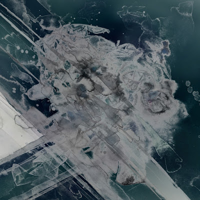
The CD art is a smaller, cropped version of the vinyl album art, something I talked about at length with their band's singer. We wanted the two images to be different, but like windows into the same concept, viewed from different vantage points. Much like music, art can feel so vastly different depending on your mood, your locale, or even the media-form you choose.

http://bosse-de-nage.com/

http://bosse-de-nage.com/

Being able to enter into the music so intensely, and trying to extract themes and essences in a visual manner, feels both intimate and strangely voyeuristic. It was a privilege to have been able to work with such a moving album, and such a unique band.

Wednesday, May 20, 2015

Custom guestbook for Doris and Jonathan

This weekend, Doris and Jonathan will say their wedding vows! I hope that this custom guestbook gets filled up with messages of joy and love, and brings them much happiness for years to come.

Having recently designed their save the dates, I brought back the botanical theme with handmade paper with embedded petals (that I've been saving for the right project for years!), silk flowers, gilt silkscreened patterned endsheets, and ribbons and bookcloth in hues of aubergine and sage. Using an extra copy of their invitation, I created an inlaid name placard, to carry over the design and make it more unique to them.

Here are some shots of the planning stages, as I played with ideas: 
It's always a lot of fun to try to create something meaningful for a wedding, based on cues from both the event ephemera and the people about to get hitched. Congratulations, guys -- it has been an honor to help make your day more special!
See more custom books on my website.

Saturday, March 14, 2015

Upcoming show - Wreck & Reference, Bosse-de-Nage, & So Stresed, 3/21/2015


Wreck & Reference, Bosse-de-Nage, and So Stressed
with guest Beast Nest
Saturday, March 21st at The Golden Bull in Oakland
8:00PM
$8 at the door - 21+


I'll be accompanying Bosse-de-Nage on a couple songs! Also this flyer is the one I talked about making using vintage woodtype. Rare book image used with permission.

Thursday, March 12, 2015

Wedding logo design for Linda and Derek - the lamb and the turtle

Preview of a wedding logo design that I made for Linda and Derek. Linda identifies with a lamb, and Derek with a turtle. I tried to capture their personalities, while still keeping a clean overall design. I just love how it looks over their playful flour-fight engagement shot! They plan to use the logo on their beer stein favors. Congratulations, guys!


Friday, February 13, 2015

Upcoming show - Deafheaven, Bosse-de-Nage, Mortal Bodies, & Cloak, 3/1/2015

Deafheaven, Bosse-de-Nage, Mortal Bodies, and Cloak
Sunday, March 1st at the Rickshaw Stop in San Francisco
7:00PM / 8:00 Show
$16 Advance - $18 Door - All Ages

http://www.rickshawstop.com/event/786287-deafheaven-san-francisco/

I'll be playing violin on a couple tracks for Bosse-de-Nage. This event is part of the Noise Pop festival, which is always a lot of fun -- sure to sell out!

Tuesday, February 10, 2015

Vintage woodtype used for digital typography

A few weeks ago, I came across an intriguing image that I wanted to use for a flyer for an upcoming live music event. The image is from a rare book, and I wanted to retain that hand-printed-ink-on-aged-paper look with the typography. At first I started to isolate the letters from around that same page and copy/paste them to form words, but soon decided I didn't like the serif typeface. After some pondering on how best to execute my plans, I contacted my friend Katherine Case, the poet and letterpress artist whom I used to intern for when she lived in the bay area. Katherine now has her own studio in Reno, Meridian Press, where she prints beautiful custom letterpress books and broadsides.

Within just a couple weeks of our conversation, I received a lovely stamp-covered tube in the mail. Katherine had hand-set both large woodtype and 72 point Helvetica, and had even printed it in teal (my favorite color) so that I could put them up on my wall afterward. Fantastic!

I then digitized the posters, creating high-resolution tiffs, and isolated the letters so that I could use them later in my digital projects. Huge thanks to Katherine! I plan to put them to good use, though I promise that I will eventually get myself back into the letterpress studio too.

  Shown here are the poster, and resulting digital type.


Additionally, I think this video does a nice job of demonstrating the feeling and atmosphere of a letterpress studio.

Monday, January 26, 2015

Newly acquired additions

Newly acquired: a lovely viola ("Sir Vile," as he shall now be called) and an Arena Reverb Pedal. Can't wait to make some dark, dreamy, moody, creepy, ethereal sounds...

I have wanted to play the viola as long as I can remember. I love the deep tones and sorrowful, sweet sound. I had played a friend's viola once before, many years ago, and now realize that it must have been a smaller instrument, because the one that I now have is quite a bit larger and more cumbersome. I'm having to stretch my fingers at much larger intervals than what I'm used to on the violin, and applying a little bit more pressure. It feels so heavy, too! But all for the love of that low C-string...so many more string-arragement possibilities! I worked my way through some beginning books, to wrap my head around the alto clef, as each string that I'm used to on the violin now has a different meaning in the notation. But it's great fun experimenting, and I can't wait to try out some songs, and start writing.


Here's a few tracks that I learned feature the viola:
The Cure – Namata, To Wish Impossible Things
The Velvet Underground – Venus in Furs, Heroin, Sunday Morning
Nick Cave and the Bad Seeds – Albert Goes West
Gary Numan – Complex, M.E., The Joy Circuit, Cold Warning
The Rentals – Friends of P.

As for buying the reverb pedal; it's something I've been hunting for ever since I started playing live -- previously I'd been using a digital multi-effects pedal, but have had the unfortunate experience of having to fumble with it in front of an audience, when the settings inevitably go off for some unknown reason. Much screeching and feedback usually ensued. I wanted a simple setup that I can be confident will provide a nice sound with limited noodling. I tried a few different ones in the store, but the Arena Reverb Pedal (see demo video below) had some really nice sounds, while still providing enough options that I'll be able to do some customization for the effect I want, and can adjust for each venue or recording setup. Now I guess I finally need to set up a little pedal board, to keep everything in order! (That's probably secretly why I wanted another pedal...to push me over the edge...!)

 More experimenting to come.