Wednesday, August 8, 2018

Imagined depictions of Lemuel Gulliver by the inhabitants of his visited remote locations

In Jonathan Swift’s Gulliver’ Travels (1699), readers follow along with Lemuel Gulliver as he visits a number of exotic and bewildering locations. Despite its entertaining and often comical tone, it is a thought-­provoking satire that explored both society and human nature. While the book reads like a travelogue, with Gulliver giving careful accounts of the beings and cultures he encountered, the inhabitants of these locales would have been observing him with as much curiosity as he observed them. How did the inhabitants of the locations he visited perceive Gulliver? Were their perceptions unbiased, or would they have been projecting their assumptions and values as much as he? What was Gulliver feeling while he was in each place, and how would these emotions manifest in his features? 

I decided to try to think about these questions through a series of imagined depictions of Gulliver throughout the years of his travels. In order to create the portrait series, I went back through the text in search of the scarce physical descriptions I recalled. I created a rubric to organize my findings about his physical attributes and emotional state, and added a column to make decisions about the artistic style and medium I would use for each piece. I decided to find a model to use as inspiration for each pose, and my friend Pär kindly agreed. I used a variety of mediums—graphite, watercolor, charcoal, chalk pastel, colored pencil, Pantone Letraset markers, and gel pen. It is my intention that the mediums and styles used for each might reflect the aesthetics of society that Gulliver visited, as the rendering might depict how they viewed him.

Here they are, labeled with the location and approximate year underneath each one.  I hope that they might serve as both a look at Gulliver, and a look back at the beholders themselves.

 Prior  to travels,  London, 1698 

 Lilliput,  1699 

 Brobdingnag,  1703 

Laputa,  1706 

 
 Houyhnhnm,  1714 

Returned  home, London,  1715

Friday, February 5, 2016

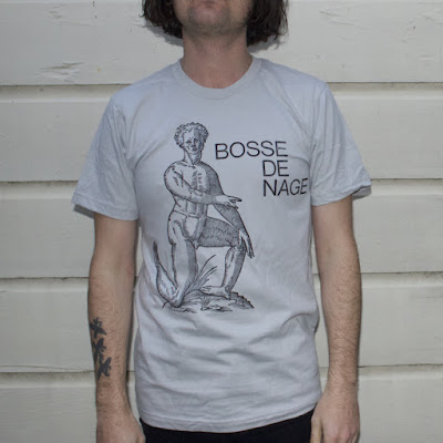
Bosse-de-Nage "Backwards Man" shirts available

Hey neat! Bosse-de-Nage made my Backwards Man flyer design into a shirt!
Go shopping for yours on the Flenser site, or come get one at a show.


Here's the original flyer, and the post where I talk about how I made the design and text. The image is one that I photographed from a rare book, and was used with permission.

Saturday, January 9, 2016

Upcoming show - Bosse-de-Nage, Wreck & Reference, Eight Bells, & Lee Noble, 1/30/2016

Bosse-de-Nage, Wreck & Reference, Eight Bells, & Lee Noble
Saturday, January 30th at Complex in Los Angeles
Doors at 8pm
$10 / 21+


I'll be playing violin for Bosse-de-Nage on a couple songs -- you know the ones. Or you will if you come see the show, anyway!

Sunday, November 1, 2015

Vintage picture frame decorative jewelry organizer


Since I compulsively purchase decorative paper, this worked out well for me!

I found some lovely vintage frames at the thrift store and decided to get crafty.
Steps: remove the artwork and trace it onto the back of the paper you want to use, then cut it out, re-frame it, and you have a pretty way to hang your jewelry.  Be sure to hang them a good distance from each other (if you make more than one), to accommodate long chains and necklaces.

Friday, October 9, 2015

Halloween "Dumpkins"

Dumpkin? Pumpernut? Whatever you decide to call them, these festive squash were a hit!


Sometimes it's really fun to make something purely for your own amusement, because it's cute, because it's festive, because you want to! I do so many projects that feel serious and important (to me) that it can be really rewarding to just let go and play. I love Halloween, art projects, sprinkles, donuts, and making treats for friends, so these were perfect in every way!

Pumpkins by Studio DIY
Originally, I was inspired by the project posted by Studio DIY, where she created beautiful little pastel gourds with individually painted colorful sprinkles.

I decided that I wanted to create some that looked like they were really frosted, and to save myself a little time by using cute holiday sprinkles instead.

Materials needed:
   -  acrylic paints (brown, white, orange, and yellow)
   -  Golden gel medium, Gloss
      (you can get this at most craft stores, or online)
   -  festive sprinkles
   -  mini-pumpkins
   -  a big, soft paint brush

Project time: approx. 1 hour, for 15 pumpkins


I liked how Kelly, the Studio DIY blogger, had applied a base coat that was a bit less pumpkin-y orange and closer to donut color. I mixed the yellow, orange, and white with a touch of brown to make a color that looked like what a donut-pumpkin-hybrid (or offspring?) would resemble. I lined up all the little pumpkins on paper grocery bags that I'd cut up for a craft surface, and coated them with the paint I'd mixed up, including the stem.

In order to make the paint super shiny like frosting, I mixed in a large amount of the gel medium (about 50/50 paint/medium), and applied it to half of the pumpkins. I did the white "vanilla" batch first. Start with a circle a little less than half an inch away from the stem, and make a bigger circle about a third of the way down the mini pumpkin, so that you can then you can messily "frost" the area in between.

The pumpkins in the back have just the
base coat - ready to be "frosted"
After they were all frosted, I sprinkled on the decorations! Do this right away, before the paint dries. If it's not tacky enough, and the sprinkles are falling off, you can dab on a bit more paint and stick them on individually. Use your fingers to place more after you've sprinkled on the initial ones, to arrange them. For the white pumpkins, I tried to use a bit more of the orange and black sprinkles for good contrast.

Repeat this with the brown "chocolate" frosting set, and you'll have a great mixed batch! In fact...wouldn't it be ADORABLE to do a set of 12 and find a pink pastry box...?

I passed these out for friends and co-workers, and they were such a big hit that people were demanding more even after they were all gone. To make them more festive, I put them in small plastic treat bags with a few candies and halloween treats, and tied it with an orange bow. NOTE: If you do give them out in a plastic treat bag, let the recipient know to take them out right away -- the moisture from the pumpkin made the sprinkles melt after a couple days, for those that were left in the bags. I might consider a little box or muslin bag instead, if I make them again.

Thanks for reading, and I hope you try it out and have fun experimenting! Thank you to Studio DIY for the inspiring craft ideas.

Saturday, September 5, 2015

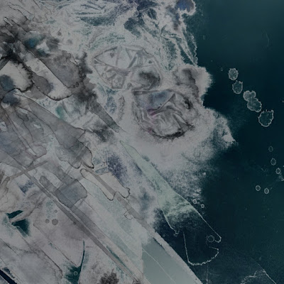
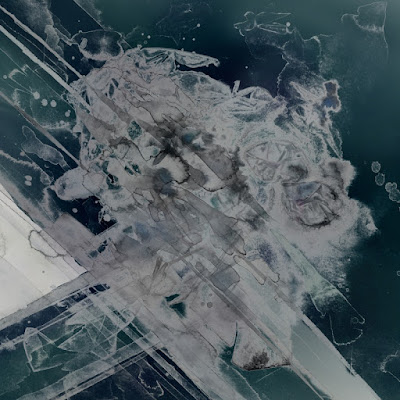
Digital after-life - the creation and re-creation of the album art for Bosse-de-Nage's III

Part of being a creator-of-things is the ability to let a piece of yourself go. Once you make something, it's sent off into the great wide world, largely outside of your control, to take on new life in the digital realm.

Sometimes I can't help but be amused at the veritable rainbow that's become of the original art for Bosse-de-Nage's album, III. Online, anyway.

I think back to the many discussions on color, visual meaning, and philosophy that the band and I had as we put the finishing touches on the work -- a journey feeling every bit as complex and transformative as the creation of a musical piece.


Indeed, the final version is quite different from the original, which I still have stored at home. I started out with pencil and watercolor, but allowed it to take on shapes of it's own, not wanting my hand to have complete control over what I hoped would be fitting such a surreal, dark, and sometimes chaotic and conceptually abstract sound. As it progressed, those were just the types of amorphous shapes that started to occur. The band found lots of hidden shapes in the work that I hadn't noticed, too; like "the angel Gabriel," and a "goat face" (which I now can't un-see.) Staring for hours at the later digitized high-resolution version of the original, zooming in and out, adjusting colors and tones (all the while with iii blasting in my headphones) -- the pleasantly maddening experience took me into the depths of the music in a way that I couldn't fully have anticipated, and I hope that it is reflected in the work.

The CD art is a smaller, cropped version of the vinyl album art, something I talked about at length with their band's singer. We wanted the two images to be different, but like windows into the same concept, viewed from different vantage points. Much like music, art can feel so vastly different depending on your mood, your locale, or even the media-form you choose.

http://bosse-de-nage.com/

http://bosse-de-nage.com/

Being able to enter into the music so intensely, and trying to extract themes and essences in a visual manner, feels both intimate and strangely voyeuristic. It was a privilege to have been able to work with such a moving album, and such a unique band.